Rapid prototyping with AI: Exploring the Claude / Figma MCP Workflow.
Exploring the Claude Code / Figma MCP workflow with an interactive prototype for a resource management tool.
Background
Back in 2018, I worked on the UI design for a resource management tool at Fathom called Arpe. The intention was to build this tool in-house, but use it day to day to better keep track of the agency’s workload, ensure projects were properly resourced, and stay on track to be delivered on time and in budget.
It would also keep track of employee workload and upcoming holidays. Unfortunately, the project was put on hold and never saw the light of day, perhaps a victim of the exact problem it was meant to solve.
The main project page of Arpe: Still a work in progress at this stage.
I love looking back at old projects and seeing where things could be improved, and since Arpe was never finished, a new resource management tool that took inspiration from it seemed like a perfect testbed for a Claude Code -> Figma MCP mini project.
Since this would be my first time exploring the 'code to Figma' pipeline, I was on a mission to understand both the benefits and limitations of this workflow. And we aren’t exactly reinventing the wheel with a resource management tool here, but the goal was to go in blind, meaning no sourcing further inspiration from existing tools. We'll just be focusing on three screens: People Management, Project Management, and a Timeline.
Gathering our ingredients
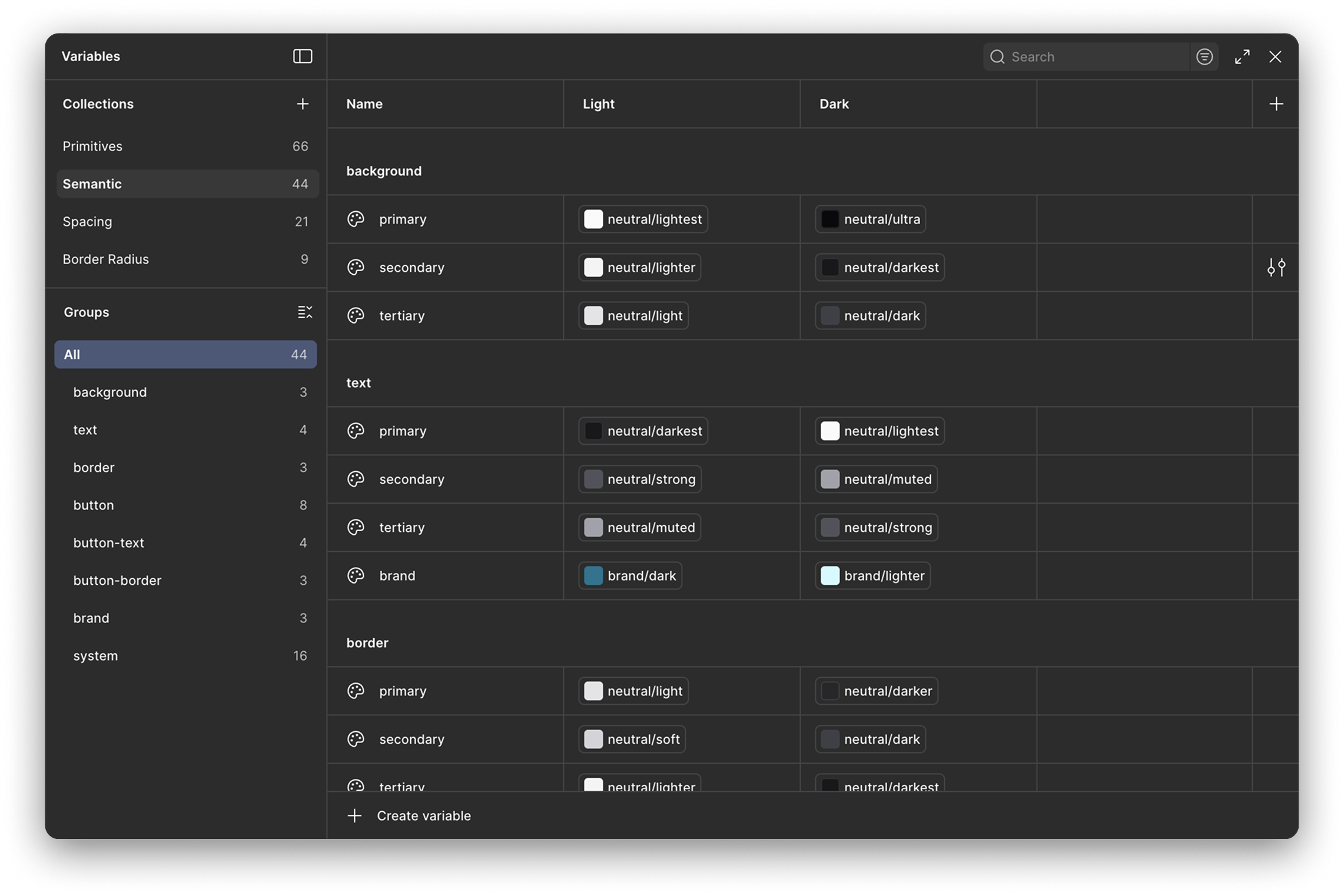
Since we're jumping into Figma blind, I began by asking Claude to set up our design token library using Tailwind CSS colours as a point of reference. I like to split my tokens into primitives and semantics; primitive tokens being the raw values and semantic tokens being the ones that carry meaning. This makes theming a breeze, as a semantically named background-primary token can now have separate values for light and dark themes. Claude assembled the token library to this spec with no trouble at all.
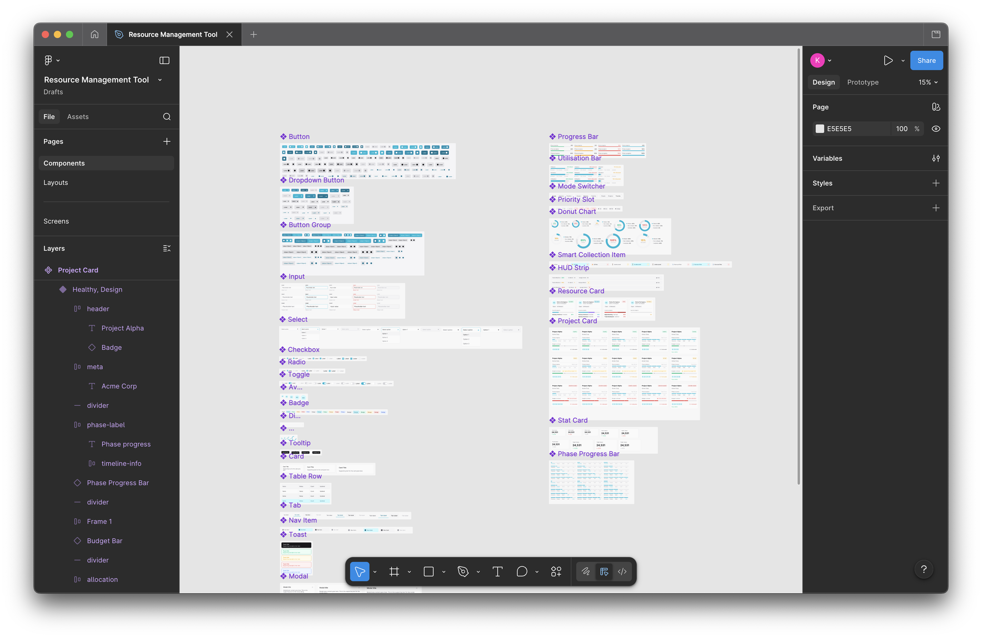
We then put together a basic component library containing core elements like buttons, input fields, badges, checkboxes, and tabs - enough to get a simple UI drafted. I explained to Claude that we would be designing a high performance, data heavy desktop application with a focus on high density analytics. I wanted to keep the brief relatively open for now, just to get the data visualisation elements such as progress bars, charts, and grids ready.
First pass: The vague foundations
At this point I asked Claude to generate a screen using our components and design token library. I gave no specific instructions as I was just curious to see what it would generate: a pretty generic take on a high performance desktop application, to nobody's surprise.
Claudes first attempt at generating a screen.
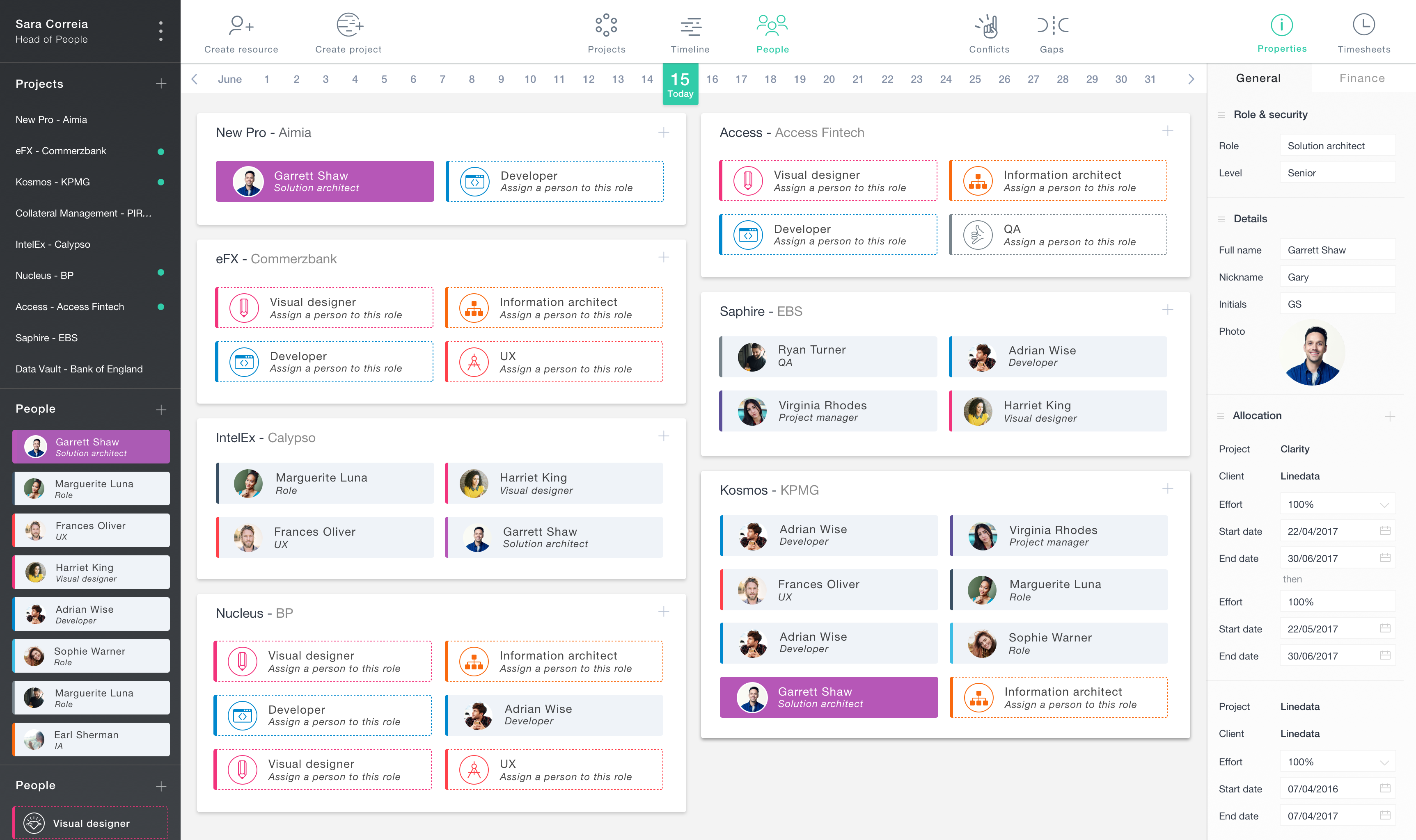
I then started giving Claude more specific instructions for the structure of the page, focusing our attention mostly on the project card. It needed two progress bars - one for budget and one for project stage - and a section showing which team members are working on the project. It also needed to show if a project is running on time, on budget, and allocated with the right amount of resources. Again, Claude is really good at creating a solid starting point:
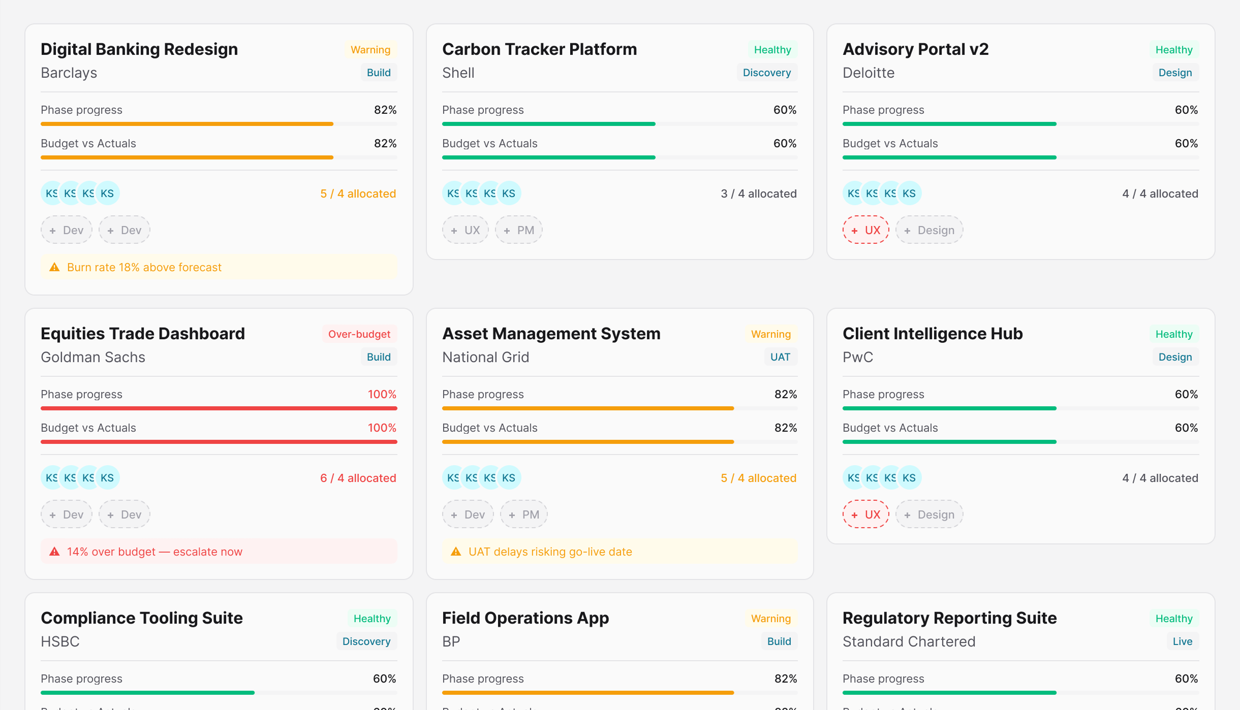
The first project cards after some manual adjustments.
Since we're working blind on this project, seeing the cards laid out like this gave me a better understanding of what needed adjusting. Both progress bars needed changing: The phase progress bar would be better suited as a segmented bar, and budget would make more sense if it displayed variance.
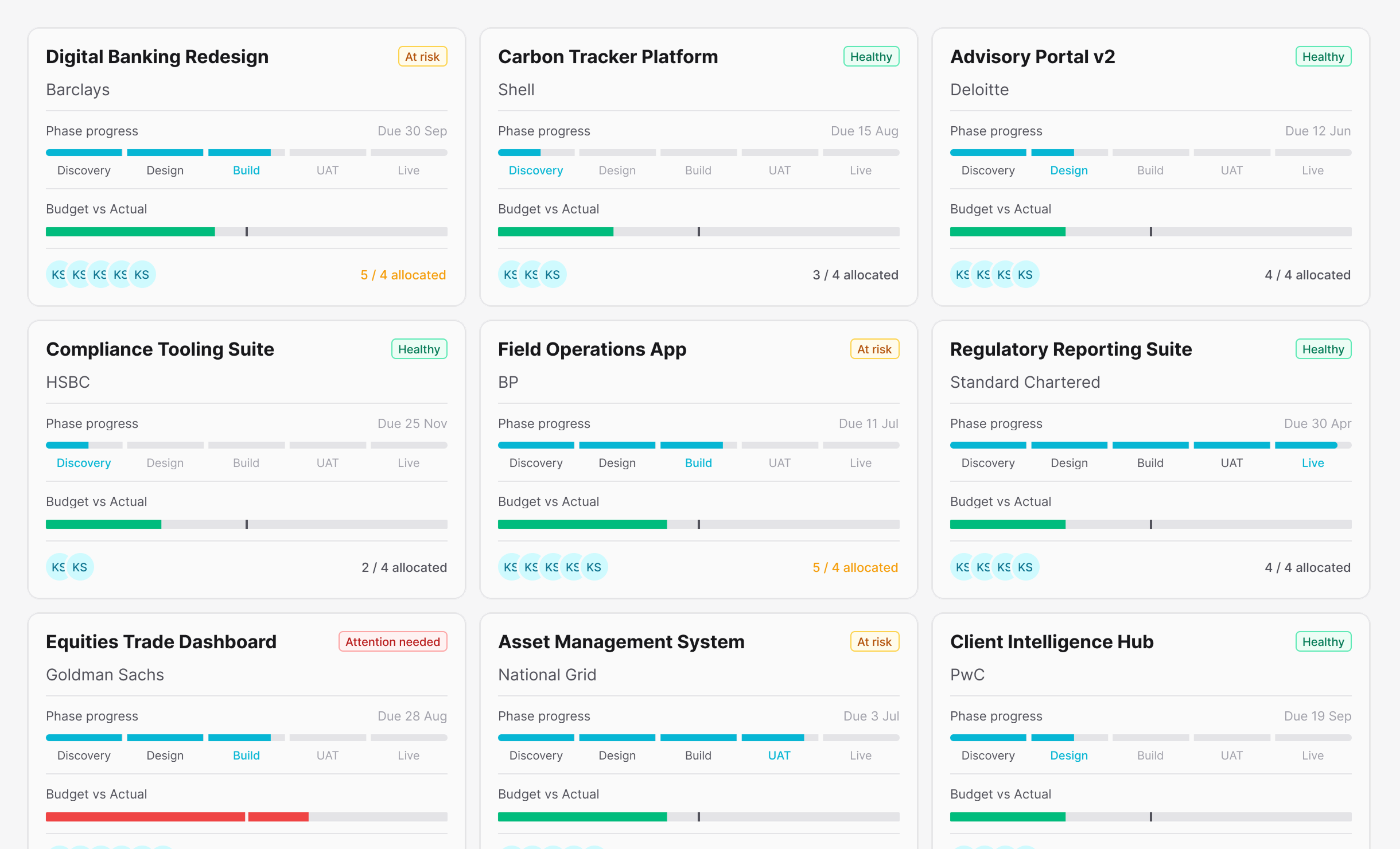
The project cards after refinement.
Limit exceeded: A recurring pain point
It turns out that the Claude to Figma MCP workflow is quite heavy on token usage; I managed to reach my daily limit within an hour or two of kicking off this project. To strike a balance, I had to conserve precious tokens by using Figma manually and only allowing Claude to do some of the heavy lifting.
The process I settled on was asking Claude to create a specific component and its variants, which I would then manually tune to my liking. This was all fairly straightforward, as long as I kept note of all the changes I make in a text file. Since Claude can't 'see' the design, I needed to document those adjustments so it could stay up to date for when we moved over to the build. I'll admit this process isn't ideal, but it keeps token usage to a minimum if I share exactly what’s changed rather than asking Claude to read the entire screen.
Overall, I found Claude to be incredibly useful for automating the time-consuming task of component assembly - each component was neatly labelled, and it produced all the required variants for size, state, variant, and layout. It only falls short if you prefer a more iterative approach - depending on the scope of the change, spending valuable Claude usage on adjusting border-radius or padding isn't the play here.
Moving over to code
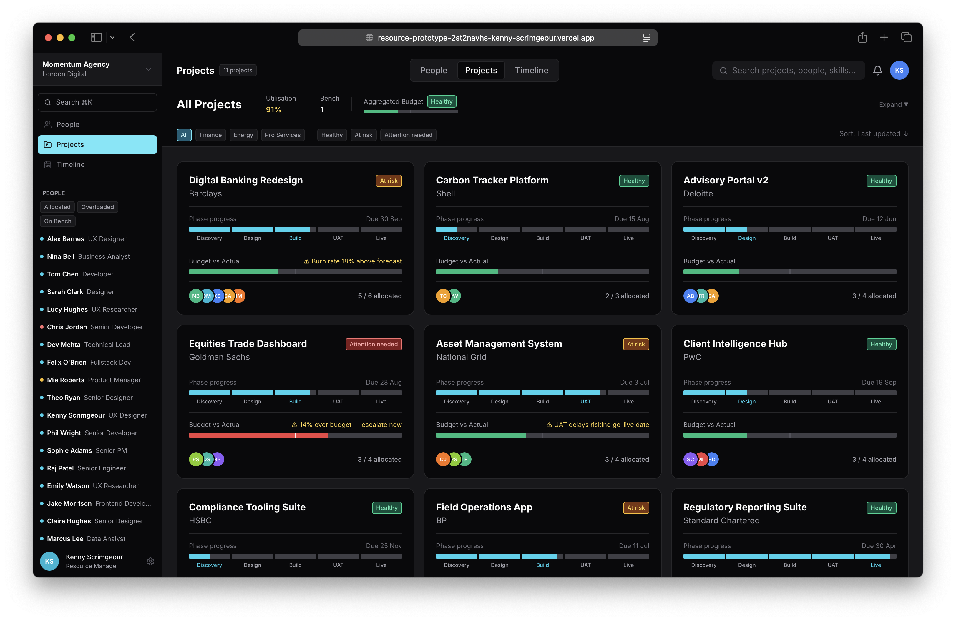
After my realisation that the back and forth between Claude and Figma was beginning to get costly, it made sense to start working on this prototype in code. We had most of the ingredients ready to go in the form of our design system, definitely enough to get started. So, I asked Claude to start building out the projects page for our digital design agency.
For added context: our imaginary agency specialises in developing products in the finance, energy and professional service sectors. In this scenario, most projects are going as planned, but a few are at risk of missing a deadline and one project is well over budget.
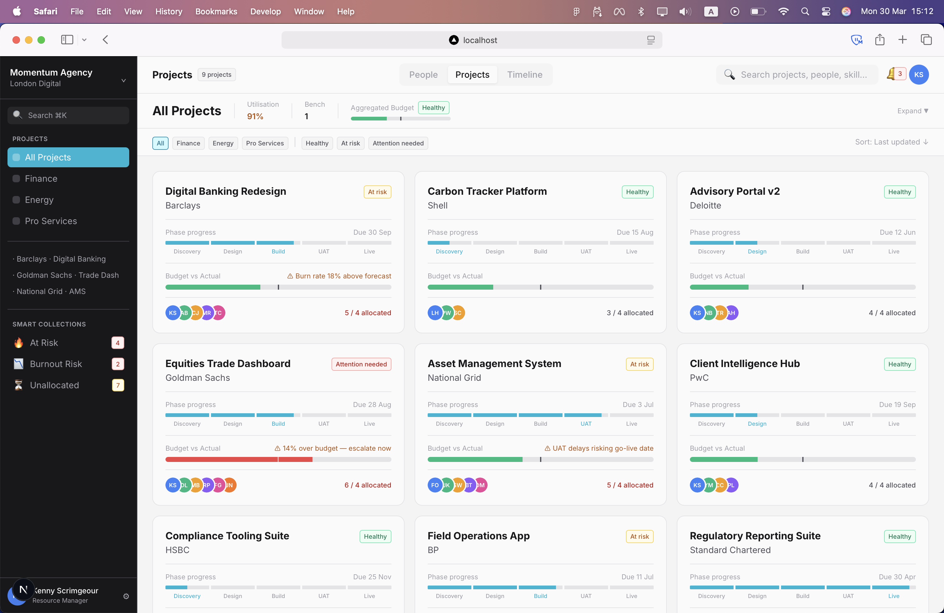
The prototype with functional filters up and running.
The first build, after a few minor styling tweaks was impressively accurate; we even had a set of functional filters that worked like a treat. I started to realise that this method of prototyping offers fewer overheads and a level of immersion that prototyping in Figma can't touch.
Next, we turned our attention to the people page and making the tabs clickable so we can switch between views. I also wanted an operational search bar to show a user filtering a list by any keyword. For example, each people card has a set of skill chips, so if I needed a Node.js specialist, I could search by that skill to bring up everyone within the organisation when scoping out a new project.

Switching between views and using the search bar
Timeline
With the project and people pages in good shape, it was time to take on the timeline. This was going to be the page that brought everything together.
At this point, I wanted to pause and make sure the agencys workload and headcount made realistic sense:
- Project lengths of 3 - 6 months, with a few longer term 12+ month projects.
- A good mix of projects in different phases, including two brand new projects in staging.
- True to life resource allocation - for example, during build phase, the number of developers on a project ramps up.
These details aren't strictly necessary but I find it far easier to 'read' a design if the logic behind it is rock solid.
We quickly jumped back into Figma to design the components we would need: A 'stub' for each person, the month banner and week dates, an absolutely positioned 'Today' indicator, and the project bar. Once the components were ready, Claude got to work on the build.
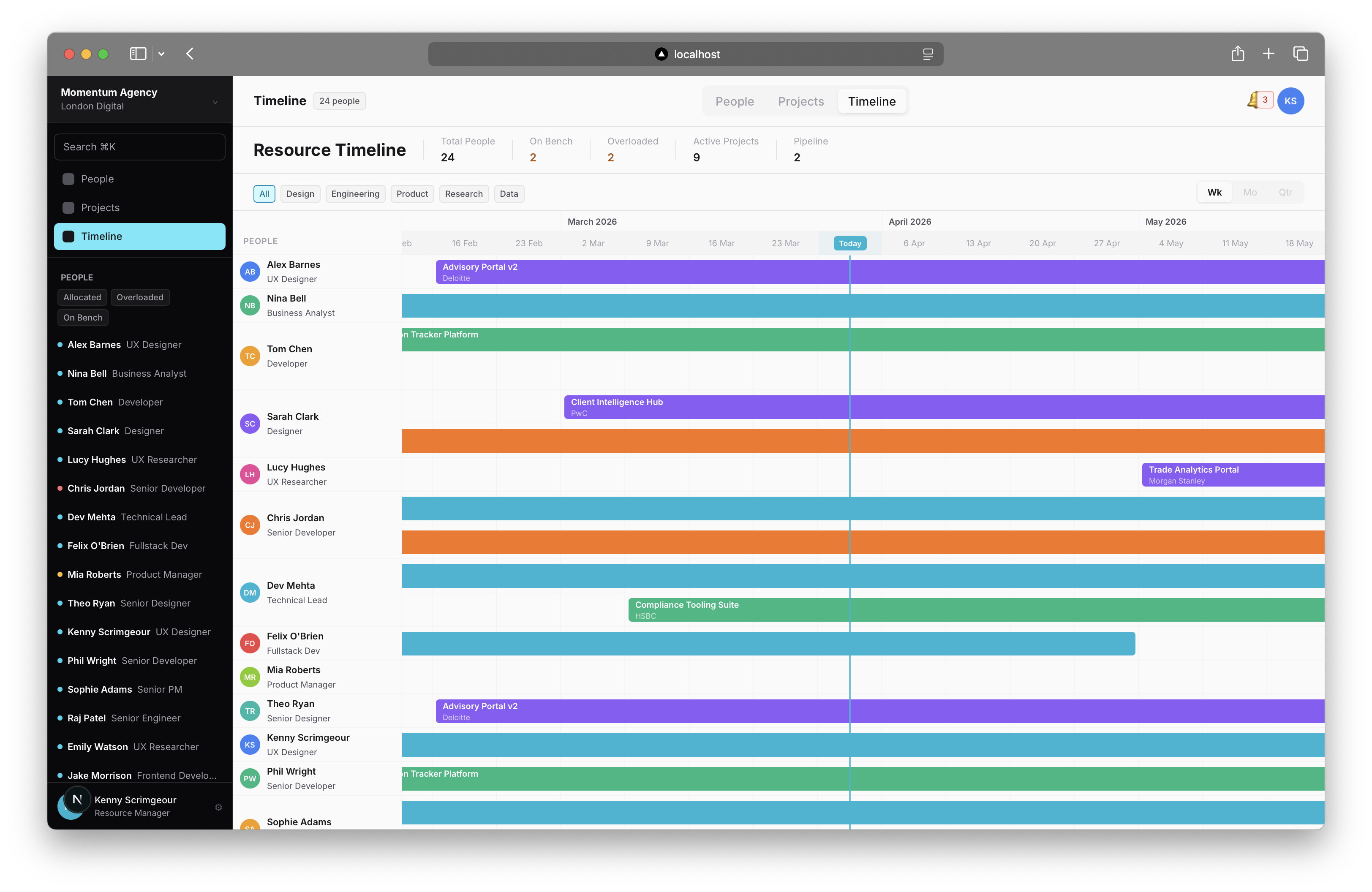
The timeline page up and running
We now have a timeline that gives us a bird's-eye view of the team's workload. There are a few changes I'd like to make further down the line, but this works for now.
Next up: getting some entry points wired up and introducing dialog windows to add or remove resources from projects.
Project and people management
So far we've got a resource management tool with no way of adding or removing people from projects. Let's change that.
We need two dialogs:
The project dialog should allow me to see its details and a more defined list of people working on the project. I can remove people from a project using a close button to the right of their name, or add others using the + Add Resource button.
The person dialog should follow the same format but with an + Add to Project button. I should be able to see currently assigned projects, the allocated time on each, and the span of the project they cover.
We also need a further pop-up that shows either a list of projects or people when adding a resource or assigning someone to a project.
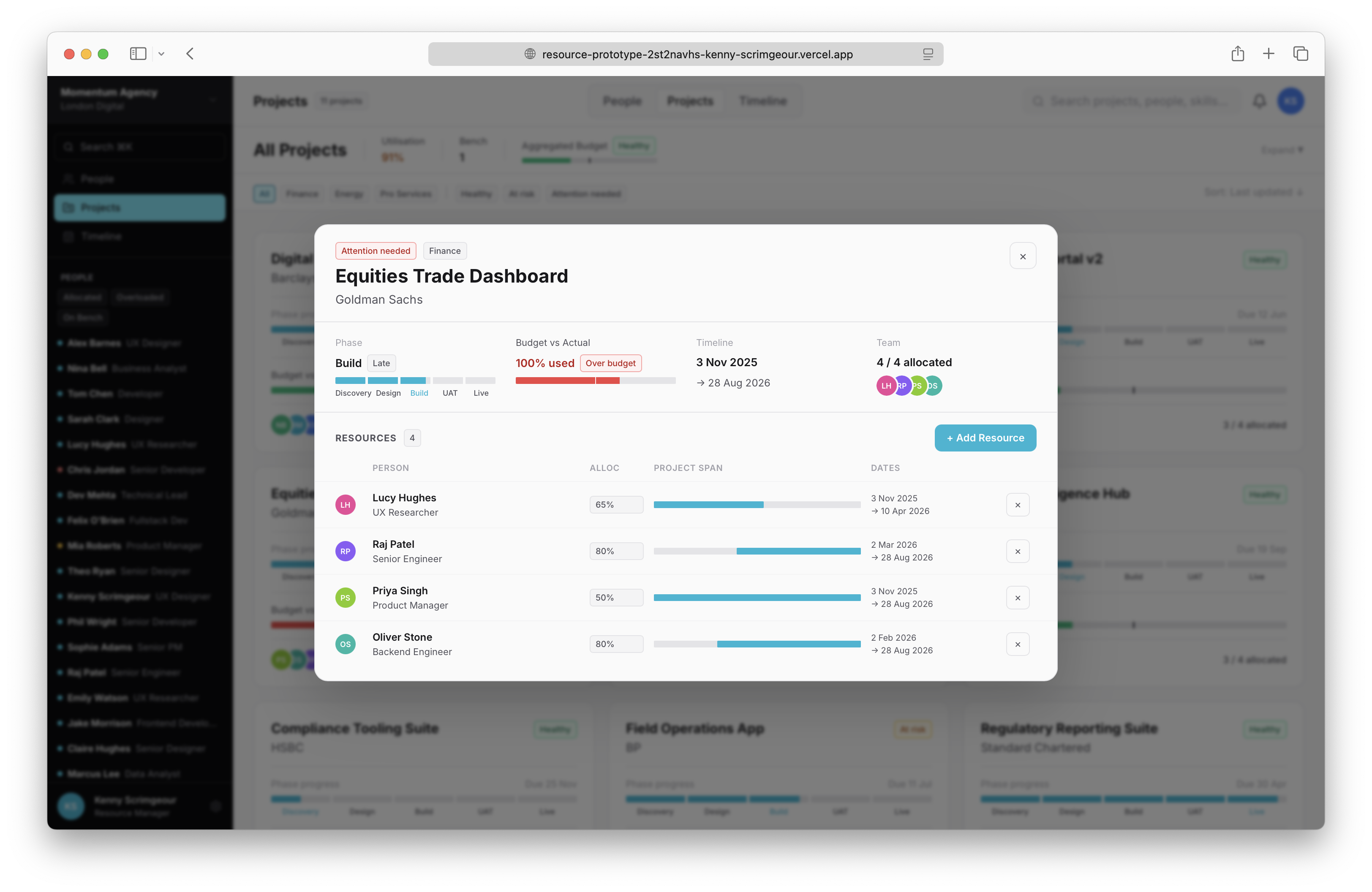
The project dialog
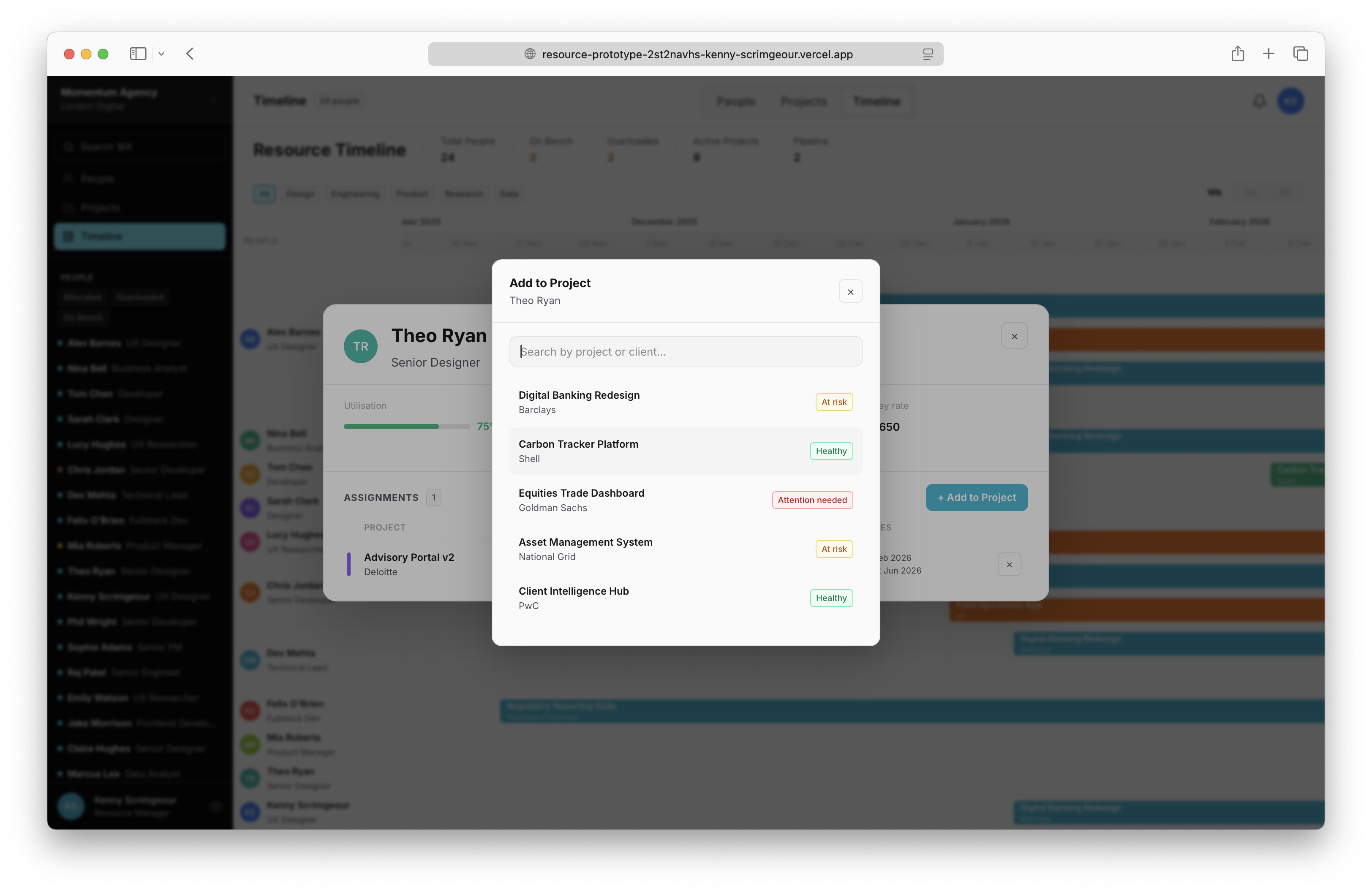
Adding a resource to a project
Finishing touches
With the core functionality of a resource management tool in place, I was very happy with the state of the build, this was after all meant to be a rapid prototype. To wrap this up, I added a theme switcher to the users avatar in the top right, replaced the emoji icons with svg icons, and made some light styling tweaks. I will continue to fine tune this project, but for now I'm satisfied with we're we've landed.
The prototype in dark theme
Final thoughts
I'm a firm believer in craft and process, and for a lot of creatives it's as much about the journey as the destination. I think that's still possible with this workflow - it automates time consuming processes like design token and component library assembly, freeing up more time for creative problem solving, and that's a good thing.
I don't subscribe to the 'Figma is cooked' hyperbole that saturates LinkedIn these days; I absolutely think there still value in traditional design tools. But what came as a surprise is how naturally I moved over to working almost entirely in code far sooner than I anticipated. Partly because Figma MCP absolutely decimated my Claude usage, but more so because of the more intimate understanding of a project you get when working directly in code - you're not just working on the product, you're working in the product.
So, I don't think 'designers are cooked' either. But it's obvious our role is changing. Sure, AI allows you to ship an unusable mess, but it also gives designers who care about their craft the opportunity to apply their knowledge and expertise to create finely tuned experiences.
If you're interested in seeing the working prototype for yourself, you can find it here.